Have you ever wondered how the colour of yarn in your local yarn store gradually shifts from season to season, the bright blue of several years ago now nowhere in sight? Well it's all to do with colour forecasting.
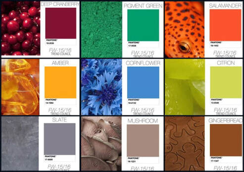
The photo above, for example, shows a menswear forecast which was put out several years ago for the season we are in now, Autumn/Winter 2015‐2016. In this, we see a slightly improbable mix of bright colours contrasting with greys and browns.
The photo above, for example, shows a menswear forecast which was put out several years ago for the season we are in now, Autumn/Winter 2015‐2016. In this, we see a slightly improbable mix of bright colours contrasting with greys and browns.
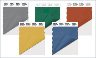
And here are the colours that we finally saw in the shops – significantly toned down, but still recognisable as deriving from the earlier predictions.
So the colour combinations that we see now start life at least two or three years earlier. Colour forecasting companies, yarn manufacturers and fashion designers meet at events such as Pitti Filati in Florence several years before the start of the season and discuss how the mood of fashion is evolving. Are things becoming more upbeat and flashy, or is there a movement towards a calmer pace of life and softer shades?
The feedback and reactions from these trade shows gradually leads to a consensus on colour choices. Sometimes these can be wildly different from previous years, but usually they are just subtle shifts in tone so you can add "this year's colour" to pep up your favourite item from the previous year.
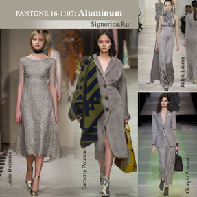 | Let's look at grey for example. The photo here shows Pantone #16‐1107 "Aluminum" (or as I would say it, Aluminium ‐ oh what a difference an extra "i" can make!) This was a key colour for the Fall/Winter 2014/2015 season and worked well with one of the major themes for that year, "Masculine Pieces". It was a steel grey shade but with a warm mid‐tone giving it a feeling of restraint and calm. |
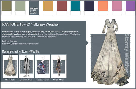
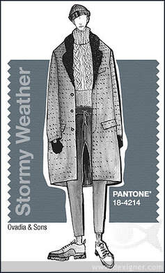
And here is the grey shade one year later on: Pantone #18‐4214 "Stormy Weather", an altogether harder, bluer tint. As it says on the Pantone forecast, this is reminiscent of the sky on a grey, overcast day – cool, constant, dependable, powerful.
 | Textile manufacturers, yarn companies and fashion designers draw on these colour influences for their inspiration as they plan ahead. Then over the next few months, 6 or 8 "themes" start to consolidate for each season. Shortly afterwards, we start to see magazine photos and catwalk shows for the coming season, and the local yarn stores have similar colours so you can make matching items. Magic! |
So I am going to start a blog series all about different seasonal colours with ideas for updating your colours along with the fashion forecasters. In the next blogpost, I'll be featuring a pair of socks using a lovely grey‐mix yarn that will be perfect for that "Stormy Weather" look, so please join me then.
Until then ‐ Happy Knitting!
Moira
Until then ‐ Happy Knitting!
Moira
 | Last blogpost: Knitting pattern stores Next Up: Druidstone Socks Our book: Reversible Knitting Stitches My Website: www.wyndlestrawdesigns.com |
Keywords: Colour Notes,
colour forecasting, color, Pantone, grey, gray,
colour forecasting, color, Pantone, grey, gray,
